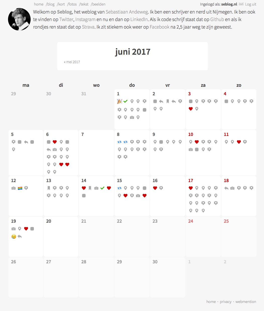
Daily and monthly overviews
This weekend I worked on some things on Seblog, and since I did some productive work on other projects today, I feel like I can write a blogpost about it without sounding so procrastinating.
Inspired by Aaron Parecki's monthly overviews, and triggered by @zegnat, who was looking for the same type of page on my site, I started to 'deconstruct' my URLs. You can now remove parts of it and still get useful pages. That was on my list of itches since november 2015 now.
So let me explain my URL design first. This post, for example, is /2017/06/20/1/daily-and-monthly-overviews. This is an idea I got from the wiki, and probably also originates with Aaron. The identifying part of it is the date, followed by an ID (the nth post of that day). The slug is just for humans and can be omitted: you will get redirected to the right one. Some posts don't even have one. This allows for a Whistle-style URL shortener which I run at 5eb.nl. (This post can be found through 5eb.nl/4ox1.)
The first step was to remove the ID, to get to a day view. I just list all the posts that are created on that day, including private posts when I'm logged in, but oldest-first instead of the newest-first order of my feeds. I also display a summary of the day in icons at the top. I'm really pleased with how it turned out!

After that, I also wanted the monthly view, to get a better overview. I'm really pleased with that too, it's nice to go through my old posts this way, seeing old memories. I'm now more interested in importing my Facebook posts too. I am still looking for a way to have some anchor or summary of the day in my monthly view, to find posts quicker, and adding a location like Aaron might do the trick, but I'll have to figure out how to do that still :)

I'm quite happy with this for now!

 Twitter
 Instagram
 LinkedIn
 Github
 Strava
 Facebook

